Creating Custom Plots
Overview
To assign accurate labels to sources, the user must be presented with as full of a picture about each source as possible. Therefore the ability to create specialised plots is paramount.
Simple
astronomicAL allows for fast plot creation using the create_plot function, which abstracts away the potentially complicated plotting code typically required and replaces it with a simple one-line call.
Optimised
By default, all custom plots have Datashader implemented, allowing millions of data points to be plotted at once whilst remaining responsive.
Collaborative
Allowing researchers to share their designs is pivotal for collaborative research. For this reason, we make it seamless to share your designs with others by automatically creating a settings page to allow new users to select which columns from their own datasets correspond with the naming convention of the author.
Custom Plots
Custom plots can be added as a new function to astronomicAL.extensions.extension_plots.
There are some requirements when declaring a new feature generation function:
The new function must have 2 input parameters:
data- The dataframe containing the entire dataset.
selected- The currently selected points (Default:None)
The function must return the following:
plot- The final plot to be rendered
The created function must be added in the form
CustomPlot(new_plot_function, list_of_columns_used)as a new value to theplot_dictdictionary within theget_plot_dictfunction, with a brief string key identifying the plot.
Note
When using create_plot within your custom plot functions, whenever you make use of a column name from your dataset, you must reference it as a key from the config.settings dictionary.
For example: "x_axis_feature" should always be written as config.settings["x_axis_feature"].
If this is not done, you will likely cause a KeyError for any external researchers who want to use your plot but have a different dataset with different column names.
Example: Plotting \(Y=X^2\)
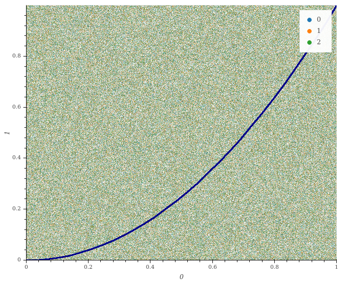
In this example, we will show the simple case of creating a custom plot which shows \(Y=X^2\) plotted along with the data.
 1def x_squared(data, selected=None): # The function must include the parameters df, selected=None
 2
 3    # This plots all the data on your chosen axes
 4    plot_data = create_plot(
 5        data,
 6        config.settings["x_axis"], # always use dataset column names as keys to config.settings
 7        config.settings["y_axis"],
 8    )
 9
10    line_x = np.linspace(
11        np.min(data[config.settings["x_axis"]]),
12        np.max(data[config.settings["x_axis"]]),
13        30,
14    ) # define the range of values for x
15
16    line_y = np.square(line_x) # y=x^2
17
18    line_data = pd.DataFrame(
19        np.array([line_x, line_y]).T,
20        columns=["x", "y"]
21    ) # create dataframe with the newly created data
22
23    # This plots the X^2 line
24    line = create_plot(
25        line_data,
26        "x","y", # config.settings is not required here as these column names are not in reference to the main dataset
27        plot_type="line", # we want a line drawn
28        legend=False, # we don't need a legend for this data
29        colours=False # Use default colours
30    )
31
32    x_squared_plot = plot_data * line # The * symbol combines multiple plots onto the same figure
33
34    return x_squared_plot # The function must return the plot that is going to be rendered
Finally, add the new entry in the plot_dict dictionary, without specifying the parameters of the plotting function:
def get_plot_dict():

    plot_dict = {
        "Mateos 2012 Wedge": CustomPlot(
            mateos_2012_wedge, ["Log10(W3_Flux/W2_Flux)", "Log10(W2_Flux/W1_Flux)"]
        ),
        "BPT Plots": CustomPlot(
            bpt_plot,
            [
                "Log10(NII_6584_FLUX/H_ALPHA_FLUX)",
                "Log10(SII_6717_FLUX/H_ALPHA_FLUX)",
                "Log10(OI_6300_FLUX/H_ALPHA_FLUX)",
                "Log10(OIII_5007_FLUX/H_BETA_FLUX)",
            ],
        ),
        "X^2": CustomPlot(
            x_squared,
            ["x_axis", "y_axis"],
        ),
    }

    return plot_dict
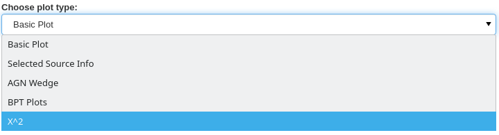
And that is all that is required. The new x_squared plot is now available to use in AstronomicAL:
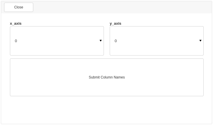
A settings page has automatically been generated, allowing users to select which of their dataset columns correspond to the author’s specified column.
Once the columns have been chosen, the user is presented with the brand new x_squared plot:
Optional Plot Flags
The create_plot function allows users to specify the number of flags to ensure that the plot is as informative as possible.
The following pairs of images are arranged so that the Flag=On is on the left and Flag=Off on the right.
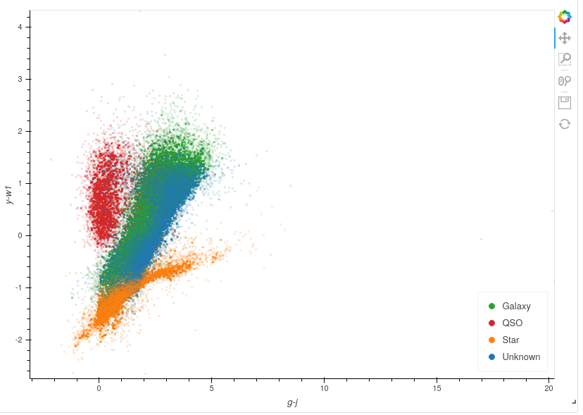
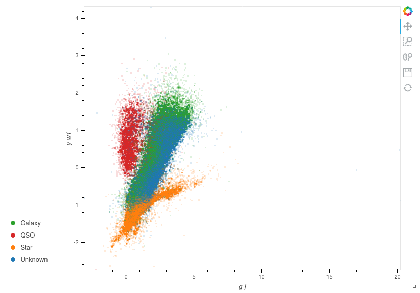
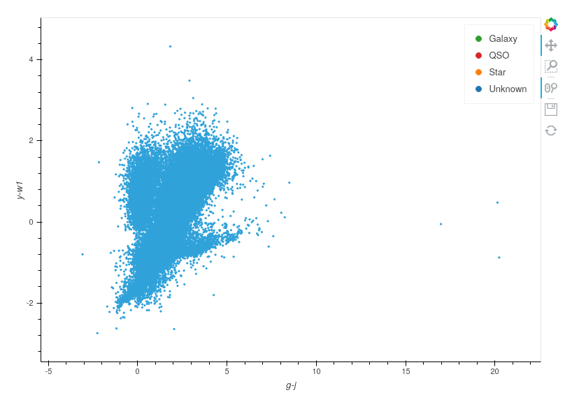
Colours
The colours flag will assign the colours the user specified in the opening settings. By choosing False, all points remain the default colour set by Datashader.
The default for this value is True.
Legends


The legend flag will include the plotted points in the plot legend. If all plots have this flag set to False then no legend will be rendered.
The default for this value is True.
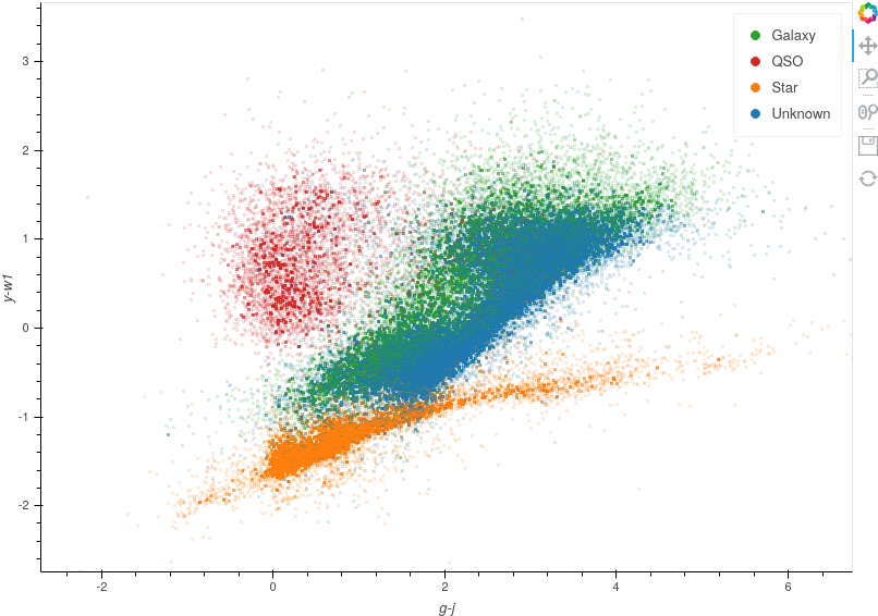
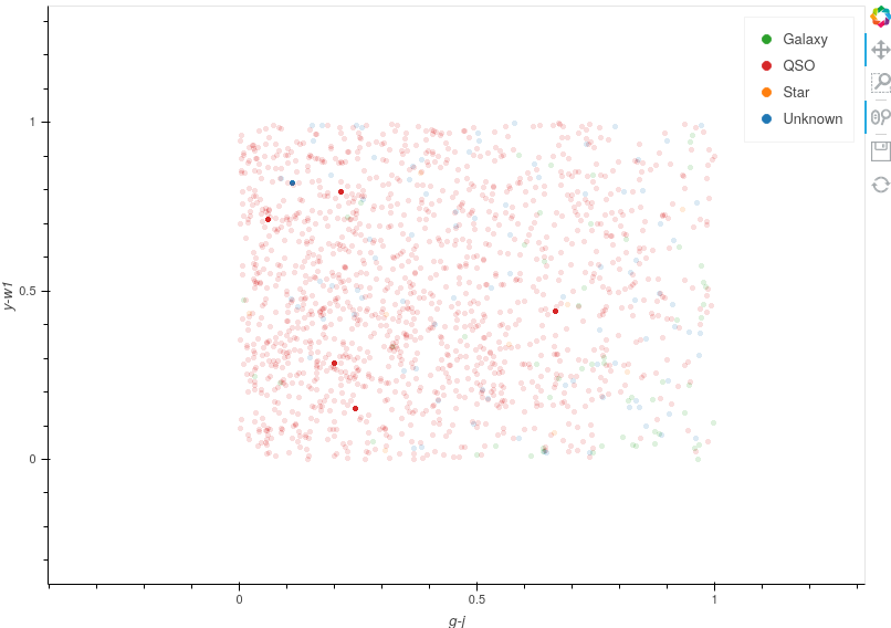
Legend Positions
The legend_position option allows you to position the legend in a more suitable place than the default positioning.
To keep the legend within the plot window you can choose between the following options: ["top_left","top_right","bottom_left","bottom_right"].
To position the legend outside of the plot window, you can use one of the following options: ["top","bottom","left","right"].
The examples above show ["bottom_right"] and ["left"] positions.
Note
If all plots have the legend flag set to False, then the legend_position flag is ignored, and no legend is rendered.
The default for this value is None.
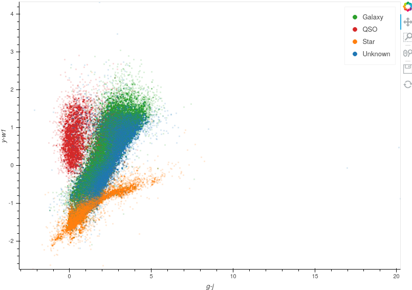
Smaller Axes Limits

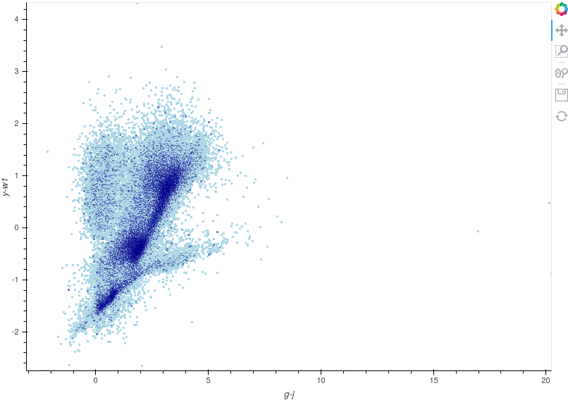
The smaller_axes_limits flag will reduce the x and y axes limits so that the default ranges are between 4 standard deviations of the mean values. This can be used to reduce the negative impact on viewing from large outliers in the data, as can be seen above. However, all the data remains and values outside this range can still be viewed by interacting with the plot. If the minimum or maximum of an axis is already within four standard deviations of the mean, this will remain the limit for that axis.
Note
If a selected source falls outside the range of the new axes limits, the axes ranges will extend to show the user that selected point so that the user does not miss out on potentially vital information when labelling.
The default for this value is None, and so no axes limits are changed.
Bounded Axes
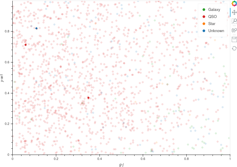
The bounds parameter, much like smaller_axes_limits, will reduce the x and y axes limits; however, it does this much more abruptly, and any data points not within the specified bounds will be removed from the plot completely. The bound is specified as follows [xmin,ymax,xmax,ymin] using the [left,top,right,bottom] style.
In the example above, we have assigned bounds=[0,1,1,0] and as you can see below, if you zoom out, there are no points rendered outside this region.
This parameter is useful when you have missing data that default to extreme values, allowing you to specify the region representing realistic values.
If a selected source falls outside this region and is not shown on the plot, you can use this to indicate that the data for the chosen axes are not available for that data point.
The default for this value is None, and so no axes limits are changed.
Slow Render
The slow_render flag removes all optimisations applied by the Datashader library and renders points using solely Bokeh. These points provide the user with much more customisability regarding glyph shapes and styles (see Holoviews documentation for more details).
Caution
Rendering points without Datashader requires substantially more processing power. As such, if you are rendering more than a few tens of thousands of points, you may notice the plots become laggy and unresponsive.
It is recommended that this is only used when you have only a small sample of points that you want to emphasise in your plot.
An example of this is when we render selected or queried points.
The default for this value is False.